Project controls reporting sure can be a pain.
Your boss might ask you for a report on project progress with actual hours versus earned hours.
These types of understandable, concise reporting within short time periods is a big part of the project controls role. It’s important that you have the ability to create meaningful reports as quickly as possible. Personally, I’ve spent a huge amount time on repetitive report creation in Excel against tight project cut-offs.
Typically, the data will come from an Oracle database or perhaps an Excel spreadsheet.
Each source of data comes in slightly different format. On top of that, you’ll have various reporting requests coming in from the project team that you’ll have to try your best to accommodate.
It’s not unusual that you’ll be asked close to the reporting deadline to change up the report or even entirely rework the format from the ground up.
It’s a depressing feeling to tell the project team that the change to the reporting will take far too much time and can’t be done for this week.
Over the last couple of years, I’ve started to use a combination of PowerQuery, PowerPrivot and Power BI that allows me to gather data from a range of sources and turn them into nice-looking, understandable reports. And the best thing is that I can quickly make changes on the fly with ease.
Enter the New Excel Data Crunching Tools
Since 2014, Microsoft has been adding powerful data formatting, modeling and report making capabilities to excel. Together these tools are called self-service business intelligence. They are designed to give the person responsible for the business facing data collection and updating to be able to create reports that make sense to the people around them. These tools are very useful for someone in a project controls role.
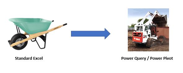
There are a few related features in MS Excel which have totally changed the way that I do project reporting. When I started to use these tools, I literally felt like I had stopped using a wheel barrow of data tasks and had started to use a Bobcat. I had a powerful data handling machine that could quickly and accurately allow me to generate reports and flexibly communicate them in a fraction of the time that I had used previously.
What are These Data Crunching Tools and What do they Look Like?
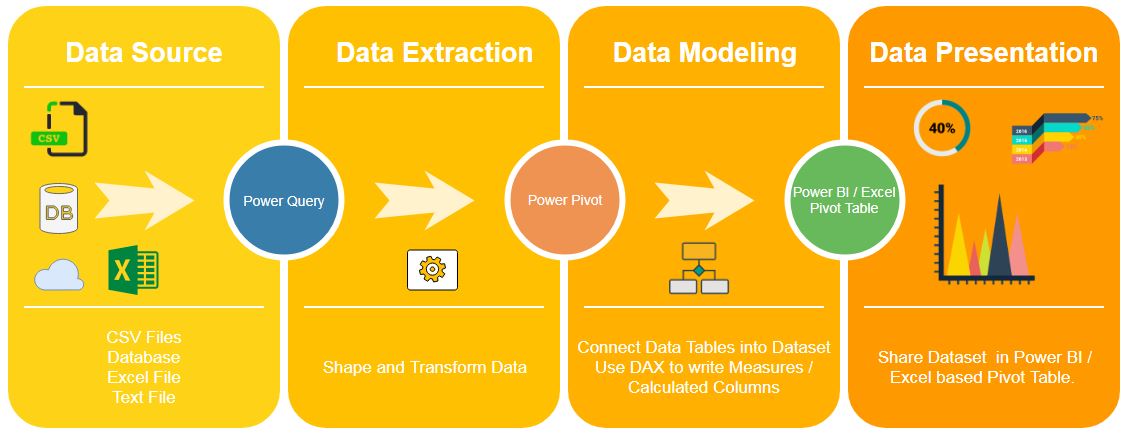
To understand the data shaping and modeling tools, you have to look at the steps that need to be taken to take your raw data sources, format them appropriately and create meaningful interactive reports.
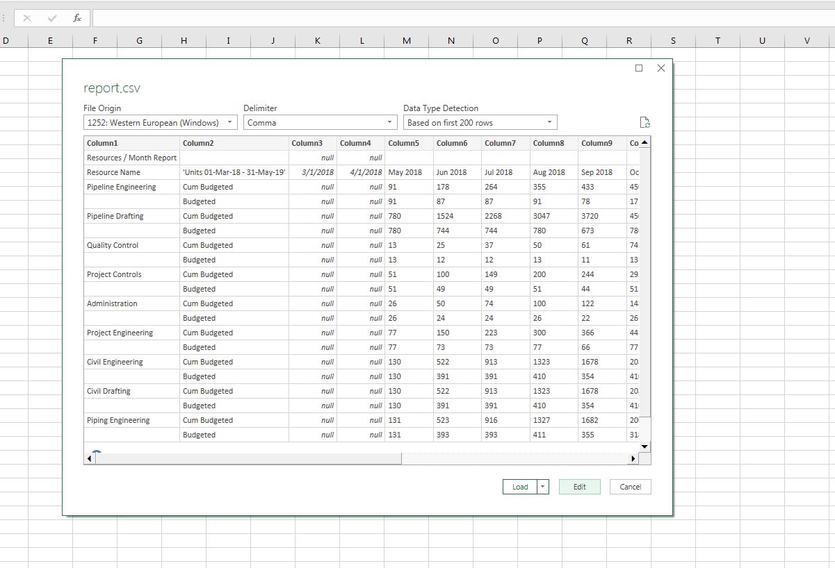
The image below illustrates how Power Query is used to format the raw data sources in the format that you get them in. The most powerful feature of Power Query is that it can accept a wide range of data types and shape and transform large amounts of data into data model ready formats.
Power Pivot is used to take that formatted data and connect data tables together. The query language DAX (similar to SQL) can then be used to create the measures and calculated columns needed to create meaningful KPIs, percentages and quantities. This information shared in a Pivot table or Chart or passed to Power BI and turned into a wide range of visual charts and tables.
What is Power Query?
Power Query can be seen as a free ranging data wrangling tool. As a cowboy uses a lasso to round up cattle, you can use Power Query take the unruly data you have and convert it into a format that can be used for data visualization.

Power Query is the data extraction and transforming feature inside of Excel. It is accessible through the Data tab at the top of the software ribbon.
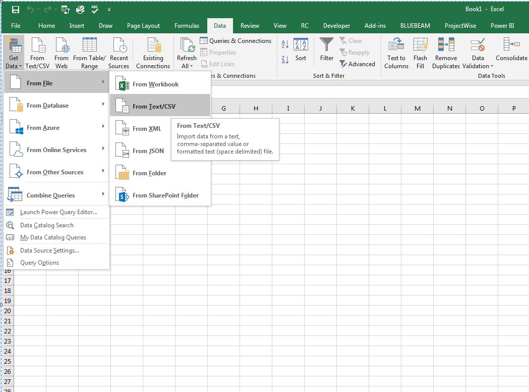
Power Query set a link between a data sources and the current excel work book. The data source can be a wide range of data types. The data is then shaped and transformed using the Power Query interface.
The way Power Query works is that the transformation steps that are applied to the data are listed on the right-hand column as Applied Steps. You can add or delete steps as you manipulate the data towards the format that you will need. Do not be fooled by the simple Power Query interface. Under the graphical interface there is a scripting language call M that can be used to create very complex data shaping solutions.
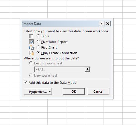
Once you are happy with the data format, you must load the data to another location. You have a few options. You could just create a connection, you can load the data to a tab in the excel work book or you can load the data to the Data Model (Power Pivot).
Power query can be used as a standalone tool or it can be used in combination with Power Pivot. As this is an over view of how Power Pivot and Power Query work together we will now have a look at what Power Pivot can do.
What is Power Pivot?
Power Pivot is best understood as a read only database that has been added to the back of Microsoft Excel. The Power Pivot database can be accessed by clicking on the Data model green icon in the Data tab.
Think about Power Pivot as the “machine” that converts your different data sources into full finished interactive reports and visualizations that end users can understand.

It will take you some time to learn how Power Pivot work, but when you do, you will be able to turn your project data into a wide range of dashboards and reports. In practical terms, if you are asked for a report that focused on a specific part of the project, you can make a working dashboard or report in 15 – 30 minutes.
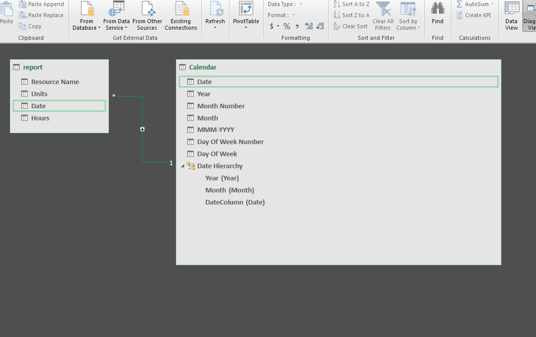
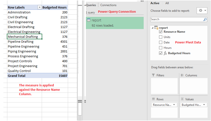
Large data tables can be passed to the data model and provided that the data is formatted correctly tables can be linked together to create a relational data base. This allows you to combine different data sources and make meaningful reports. The massive advantage of this approach is that once the data source is correctly shaped and the Power Pivot relations are correctly applied, you can quickly make all sorts of report tweaks without much rework and with a low chance of error.
To analyze the data in the data model there are two options. You can write Measures of Calculated Columns. Power Pivot used a SQL like querying language called DAX to write the measures and calculated columns.
It has been said that DAX is simple but not easy. If you are familiar with SQL, DAX will come quite naturally, if you are not it will take some time to get your head around how the language works. Have no fear however, even the simplest DAX formulas will give you power report creation skills.
This is an example of a simple SUM measure that I have applied to the Hours columns in Power Pivot.
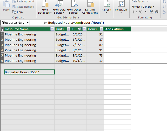
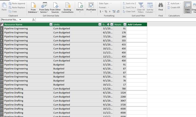
The Power Pivot data can be accessed in excel like a normal Pivot Table, with the measures and calculated columns.
What is Power BI?
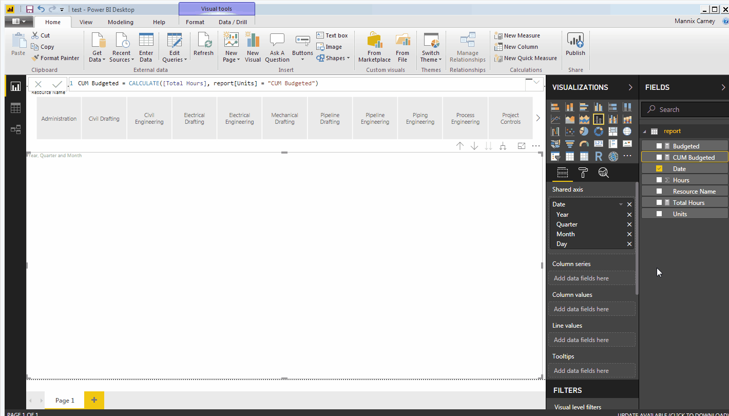
Once your data has been shaped using Power Query and converted into a Data Model in Power Pivot you can pass the data model to Power BI.
Power BI is a cloud-based data visualization software system that is designed around Power Pivot. Power BI is a separate software system than Excel and you will have to download it as a standalone system.
There are a whole range of cloud based visualization systems available today. You just have to type data visualization into google and you will be overwhelmed by options.
The reason that I like Power BI is that it is so well integrated into Excel. The Power Query and Power Pivot tools that we have gone through represent 90% of the work in making a functional dashboard or report.
The Power BI authoring software is a free download. To share the data visualizations that your create you will have to pay approximately $10 per month per report user.
If you set up an efficient Power Query / Power Pivot / Power BI system, you can update your project reports in your usual system (for me this is a combination of Primavera P6 and a set of excel spreadsheets). Then I take a couple of minutes to refresh and check my Power BI connects. When I press publish all the dashboards and reports related to that dataset are instantly updated.
Power BI allows me to replace time consuming and error prone reports with a superior product, personalized and interactive dashboards.
Conclusion
I hope you enjoyed this overview of how the Data Analytics tools available in Excel work together. I have found each tool to be useful as a project controls professional.
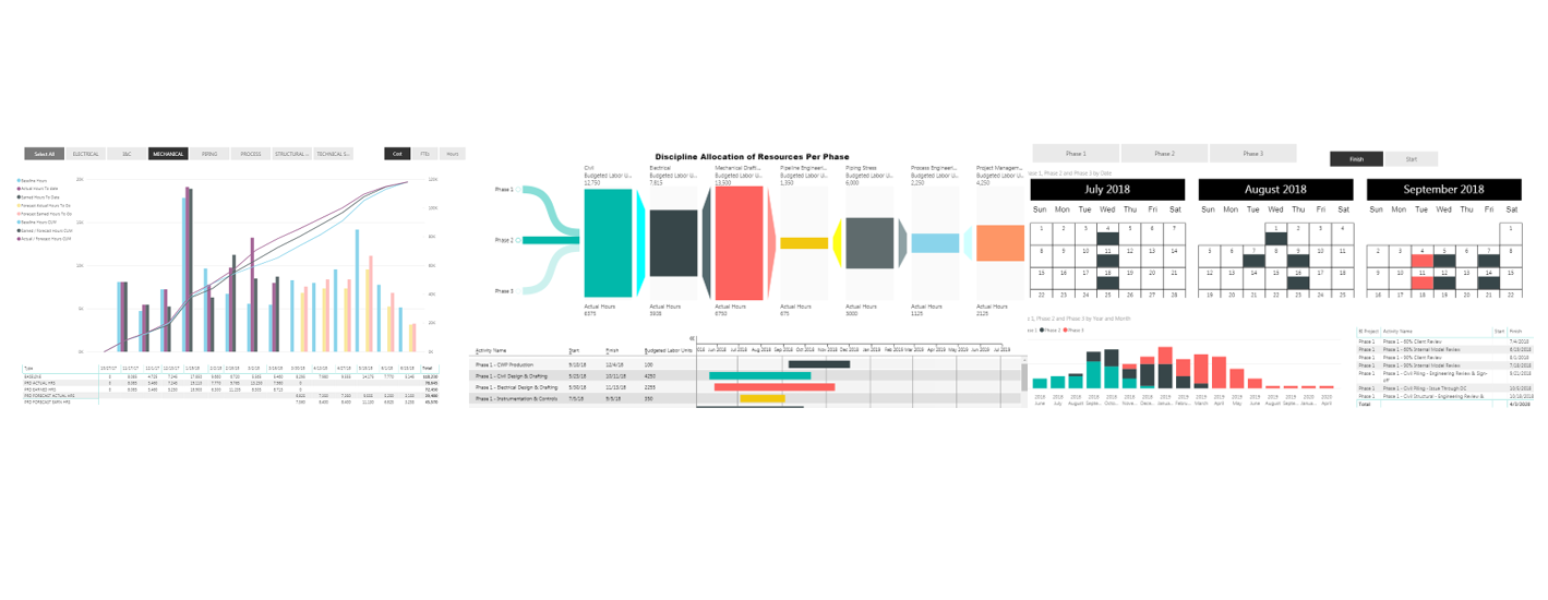
Please have a look at the rest of my site where I give specific examples of Primavera P6 based Power BI dashboards that I have found useful.
Nice article. P6 needs to be more BI process friendly.
Hi Mannix ,
Thanks for great info you put them all in here , I have tried few times to connect power query to P6 but I have not been successful even I used this blog “https://datamonkeysite.com/2017/03/11/using-power query-to-read-an-xer-file/” to use the existing xer reader through power query but have not been successful to download all data , I wonder if you can help me step by step to create that connection between excel and p6 data base .
your prompt reply is appreciated.
Thanks
@asghar I discovered that I needed to download the SQLite db driver before I could get Power BI to connect to P6 and read the tables.
Mr. Carney,
I wish this e-mail finds you well.
Do you have any documentation regarding Primavera P6 database correct tables and fields in order to create a S-Curve in Power BI? I would like to skip the excel step and go straight to SQL.
I appreciate your time and help.
Regards,
I’m sure Oracle will come up (or already has) some sort of visualtion add-in for P6. I love, love, love P6. But Oracle is a lot like Apple – you can look at the engine in your car but you can’t pull out the dipstick to check the oil.